Nature.org Preserves
Helping visitors find and plan a visit
In progress: high‑fidelity design and implementation planningWhat I’m doing
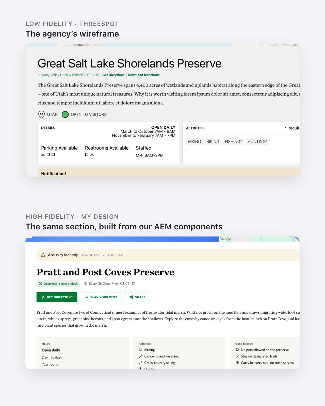
- Taking an agency’s low‑fidelity wireframes to high‑fidelity components we can actually build in AEM.
- Redesigning the templates around which data can come from TNC’s land management system and which has to be written by hand.
- Owning the release plan, and making the resourcing case that brought a technical business analyst onto the project.

The wireframes assumed every detail would flow in from our land management system. What happens to the visitor, and to the people maintaining 350 pages, when it can’t?
The challenge
Nature.org has roughly 350 preserve pages: places people can visit in person. Over time those pages drifted.
- No one was clearly accountable for keeping them up to date.
- They leaned toward conservation storytelling, not what a visitor needs to plan a trip.
- Details on the public site could disagree with the same details in TNC’s internal land management system.
The goal is a preserve experience built around visitors, with conservation stories still in the mix, and accurate information that comes from one source instead of two.

Discovery
Our agency partner, Threespot, led discovery: research, audience journeys, a content model, two rounds of low‑fidelity wireframes, and usability testing. I guided them through every step. I reviewed and shaped each wireframe round, fed into the consolidated TNC feedback, and checked every component choice against what our AEM platform already had. The wireframes were built from our existing components, so part of the job was walking Threespot through them and catching where the wrong ones had been used.
Usability testing
The label worked. Its placement didn’t: the main site navigation wasn’t leading people to it. Other findings shaped the templates directly:
- People wanted short, focused content over long‑form pages.
- Visit information should be out in the open, not buried.
- The map and filters were well received.
- Alerts belonged higher on the page.
- “Plan Your Visit” and “Know Before You Go” felt like the same section, and the seasonal icons confused people.
My role
Threespot handed us low‑fidelity wireframes. Everything from there to a buildable product is mine: choosing the components we need most, working with developers on what we can build, designing them in high fidelity, and presenting to stakeholders.
As Product Owner, I also plan how it ships: which new components and updates go into which release, and what help we need to get there.
- Agency guidance
- Component prioritization
- AEM feasibility
- High‑fidelity design
- Data and governance strategy
- Stakeholder reviews
- Release planning
- Resourcing
Design for the data we actually have
Threespot’s wireframes assumed every field would come from TNC’s land management system. In practice, only some of it can be connected with the capacity we have.
That isn’t just a technical detail. Every field that can’t be connected becomes content an author has to write and keep current, by hand, across hundreds of pages. So for each part of the page, I work out where its data will live, how that affects authors and visitors, and how the template needs to change because of it.
From the land management system
Pulled in automatically. One source of truth, so the public page and internal records can’t disagree.
Deferred
Not worth building yet. The template is designed so it can be added later without a redesign.
Build for today, ready for tomorrow
Some recommendations depend on automation we don’t have yet. None of our current AEM components are automated, and we don’t have the backend data infrastructure to drive them.
That changes next year, when TNC moves to a modern cloud version of our AEM platform. So these modules are designed to work now, and to get smarter after the upgrade without redesigning the template.
These decisions are still being finalized.
Related stories
- Recommended
- Stories pulled onto each preserve page automatically
- Today
- Authors hand‑pick stories using our existing components
- After upgrade
- Revisit automation on the new platform
Nearby preserves
- Recommended
- Preserves near the one you’re viewing, surfaced automatically
- Today
- An automated “Check out other preserves” module, without location
- After upgrade
- Revisit on the new platform
From low fidelity to buildable
From Threespot’s wireframes, I picked the components we need most and checked each one with our developers: can AEM do this, and should we extend an existing component or build a new one? I’m designing them in high fidelity, with the user experience and the backend connection in mind together.
The first high‑fidelity round was approved by stakeholders. The second round, a visual refinement of every component we’re building, is underway now.

Product ownership
Once the components are final, the question becomes how to ship them. I’m planning how new components and updates to existing ones fit into upcoming releases, and I pitched leadership on how long this will take and what help we need.
A technical business analyst
Someone who understands AEM and its integrations, to define which data lives where before development starts. TNC is bringing one on as a direct result of the pitch.
An additional UX designer
We have two designers for a project of this size. I made the case for adding a third.
Where it stands
- Discovery and usability testing Threespot, guided by TNC
- Low‑fidelity wireframes Threespot
- High‑fidelity design, round 1 Approved
- High‑fidelity design, round 2 In progress
- Business analysis and data contracts
- Technical planning and development sprints
- Pilot with selected preserves
- Rollout Targeted by 2028
Reflection
Governance can sound like a back‑office concern. On this project it decides whether a visitor sees the right hours on a Saturday morning.
The agency designed the ideal experience. My job is to design the version a small team can build and keep accurate across hundreds of pages, and to plan how we get there.
Collaborators
- Danae Wolf Associate Director of Marketing and Communications, Leveraging Our Lands (project owner)
- Christian Cole Project Manager
- Jordan Fisher Director of Digital
- Mike Lewis Director of Marketing Technology
- Tracy Swift Marketing Communications Specialist, Leveraging Our Lands
- Threespot Discovery and low‑fidelity wireframes